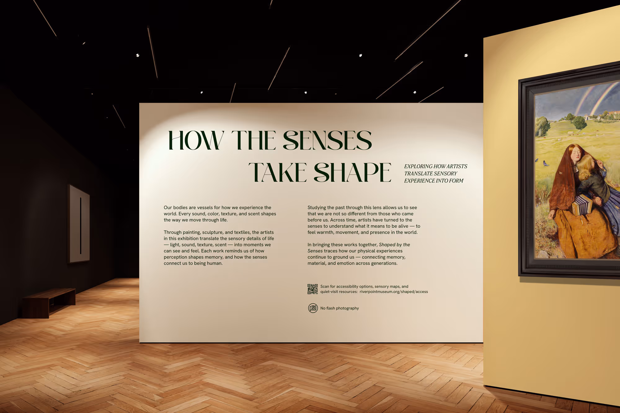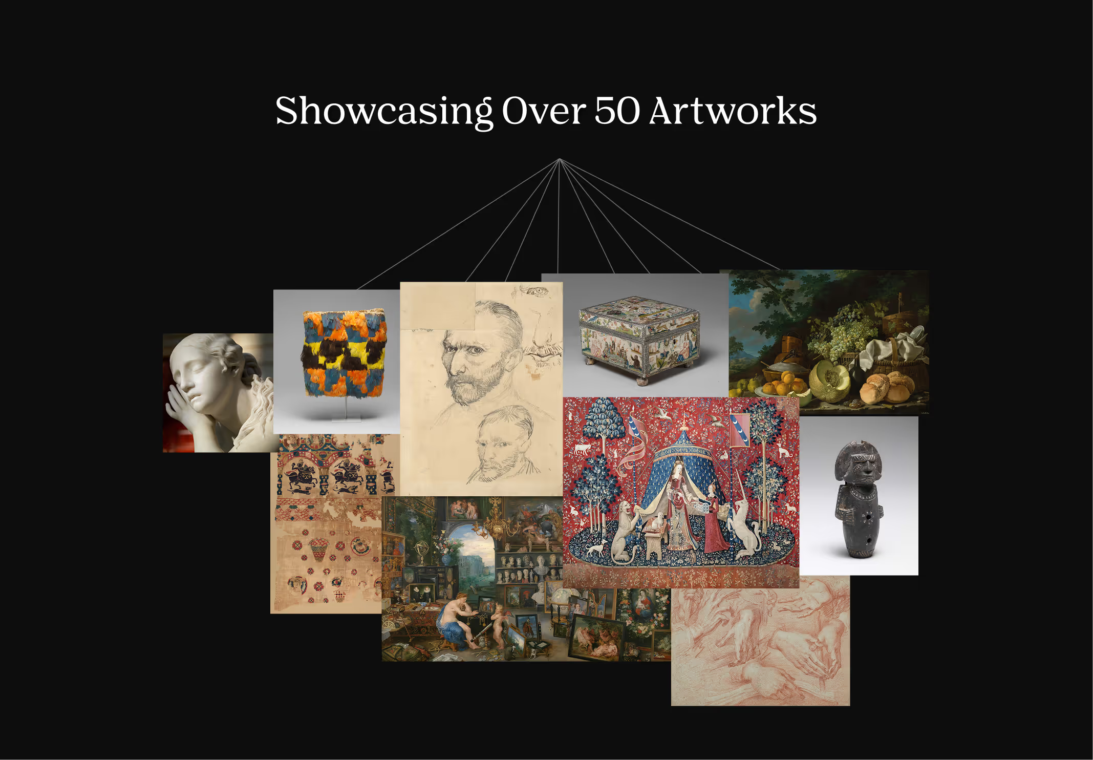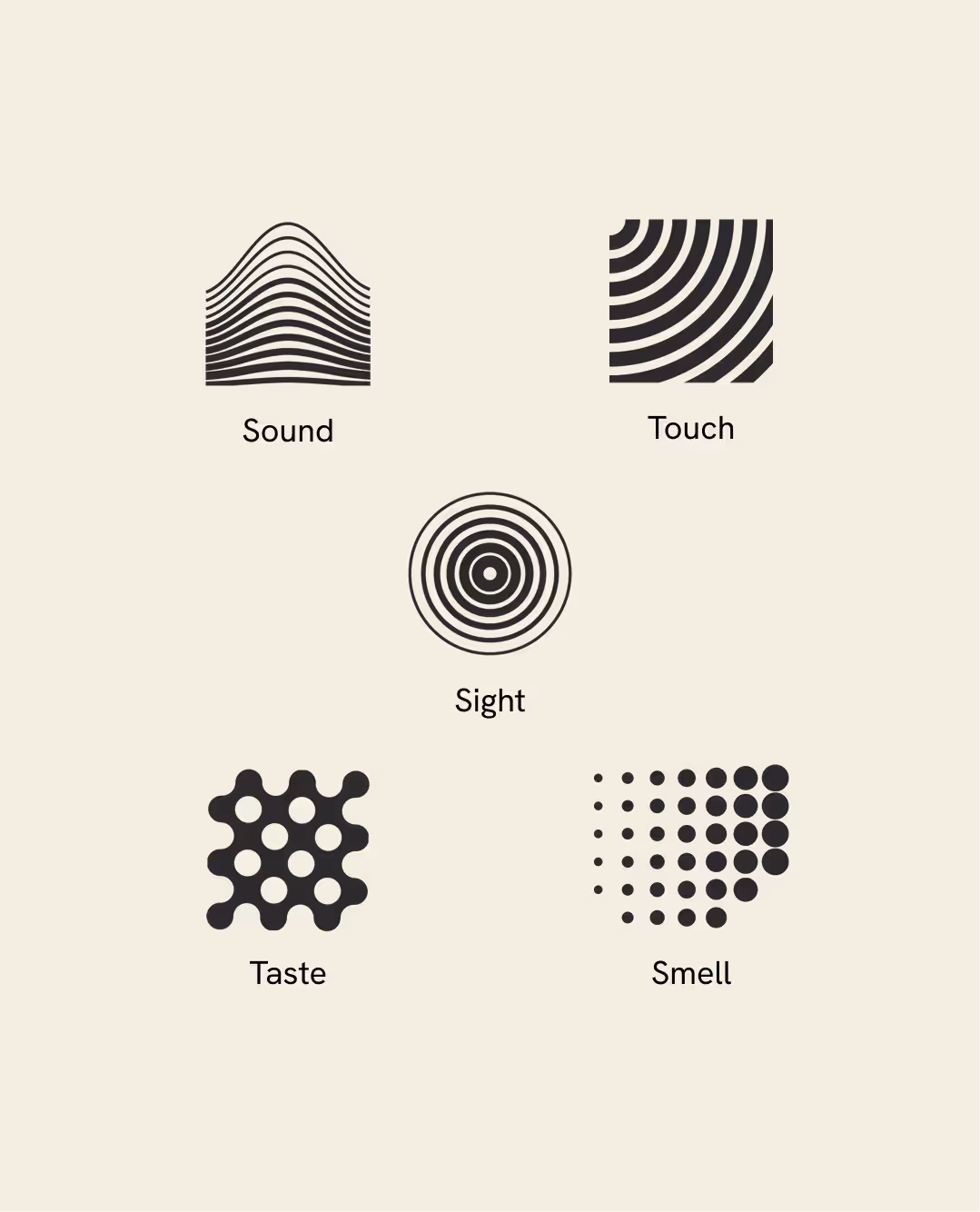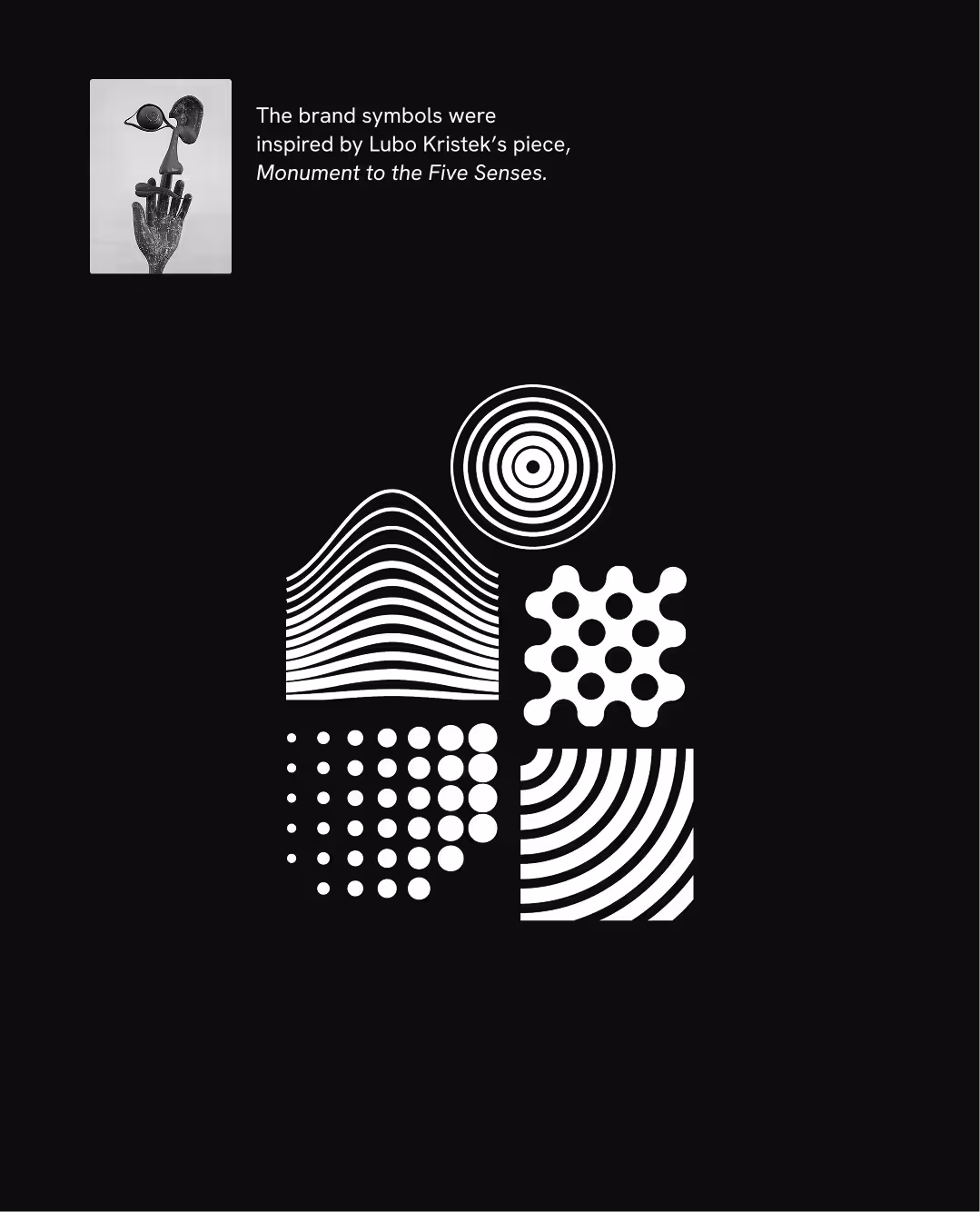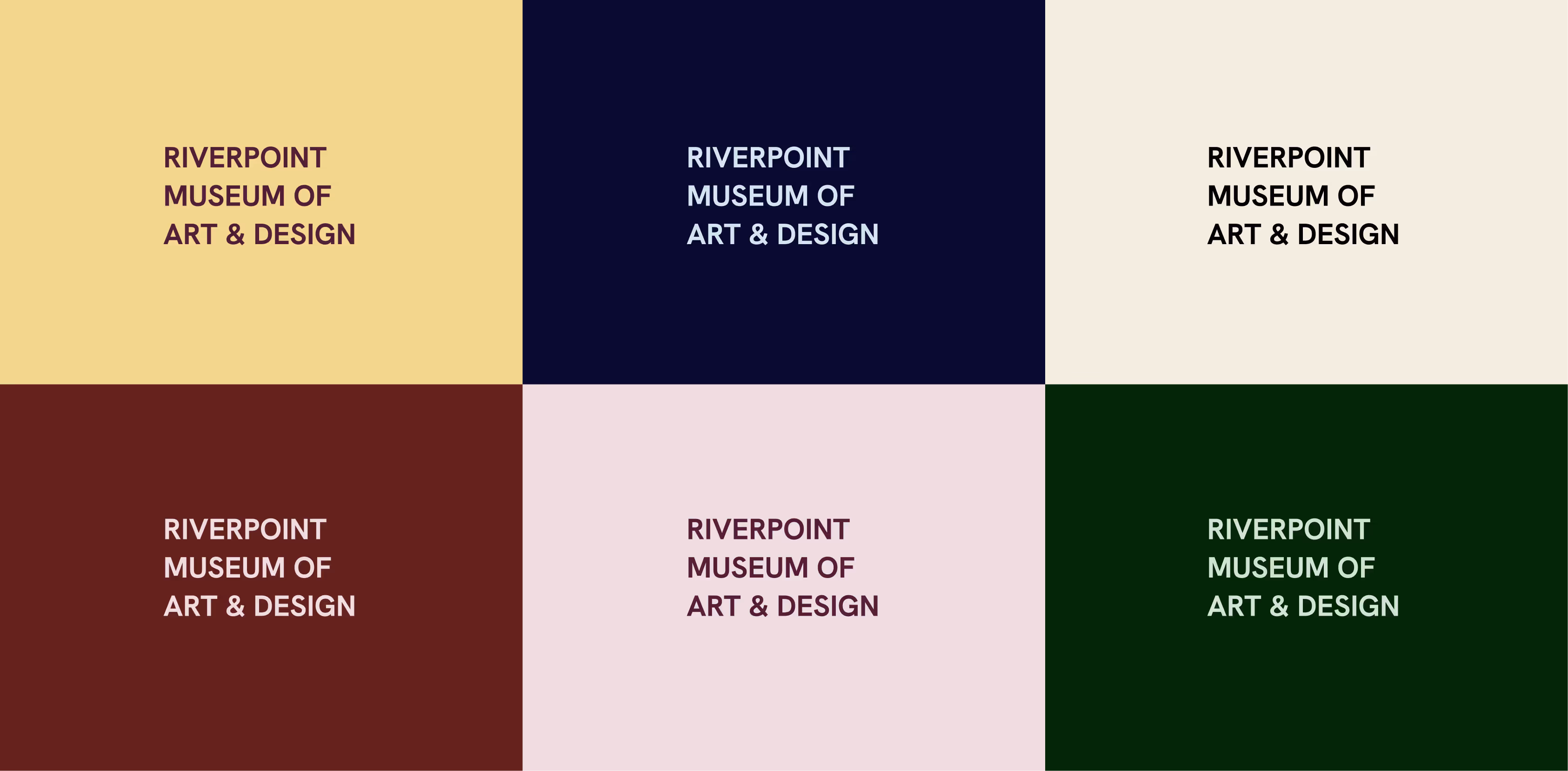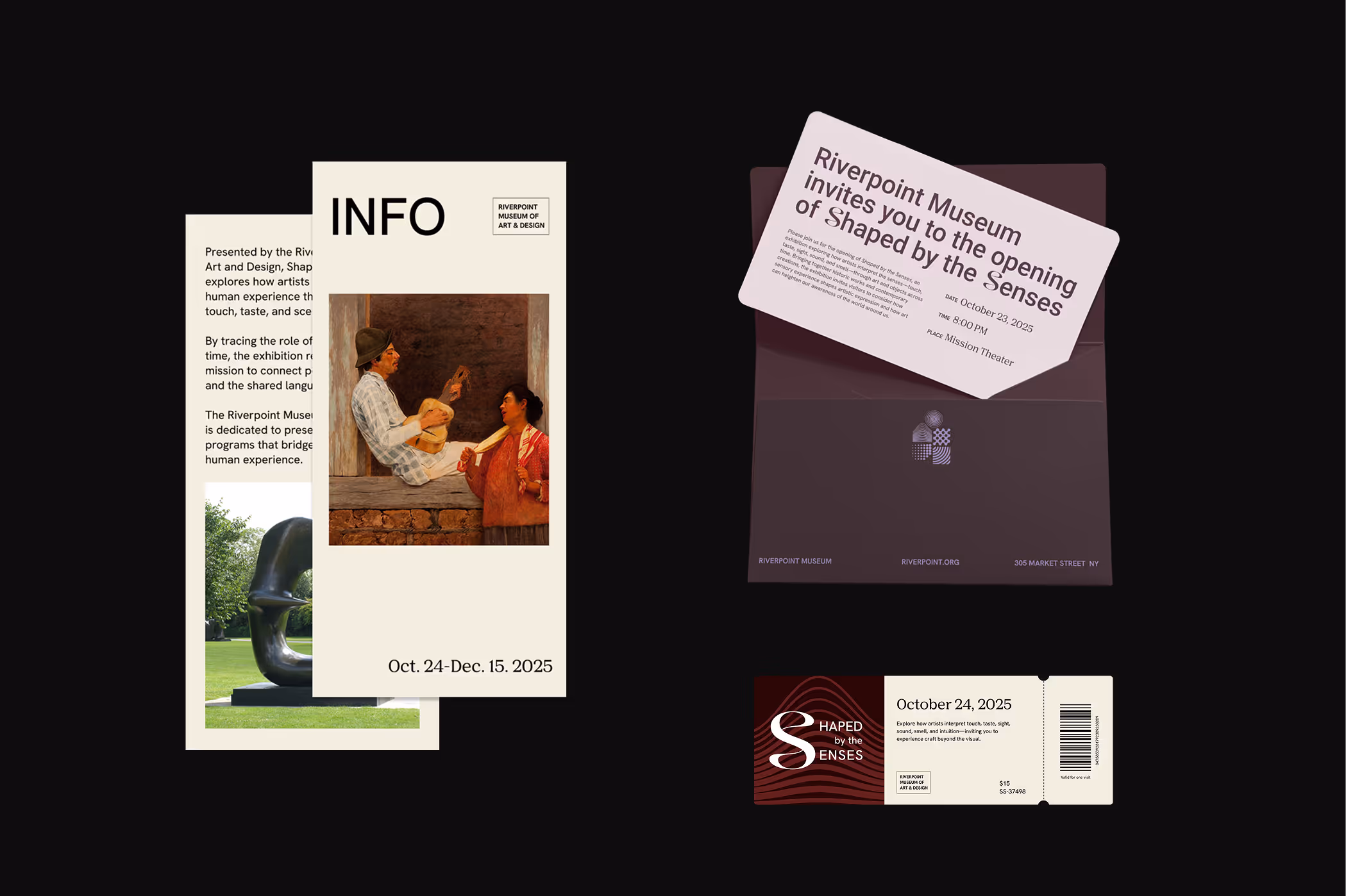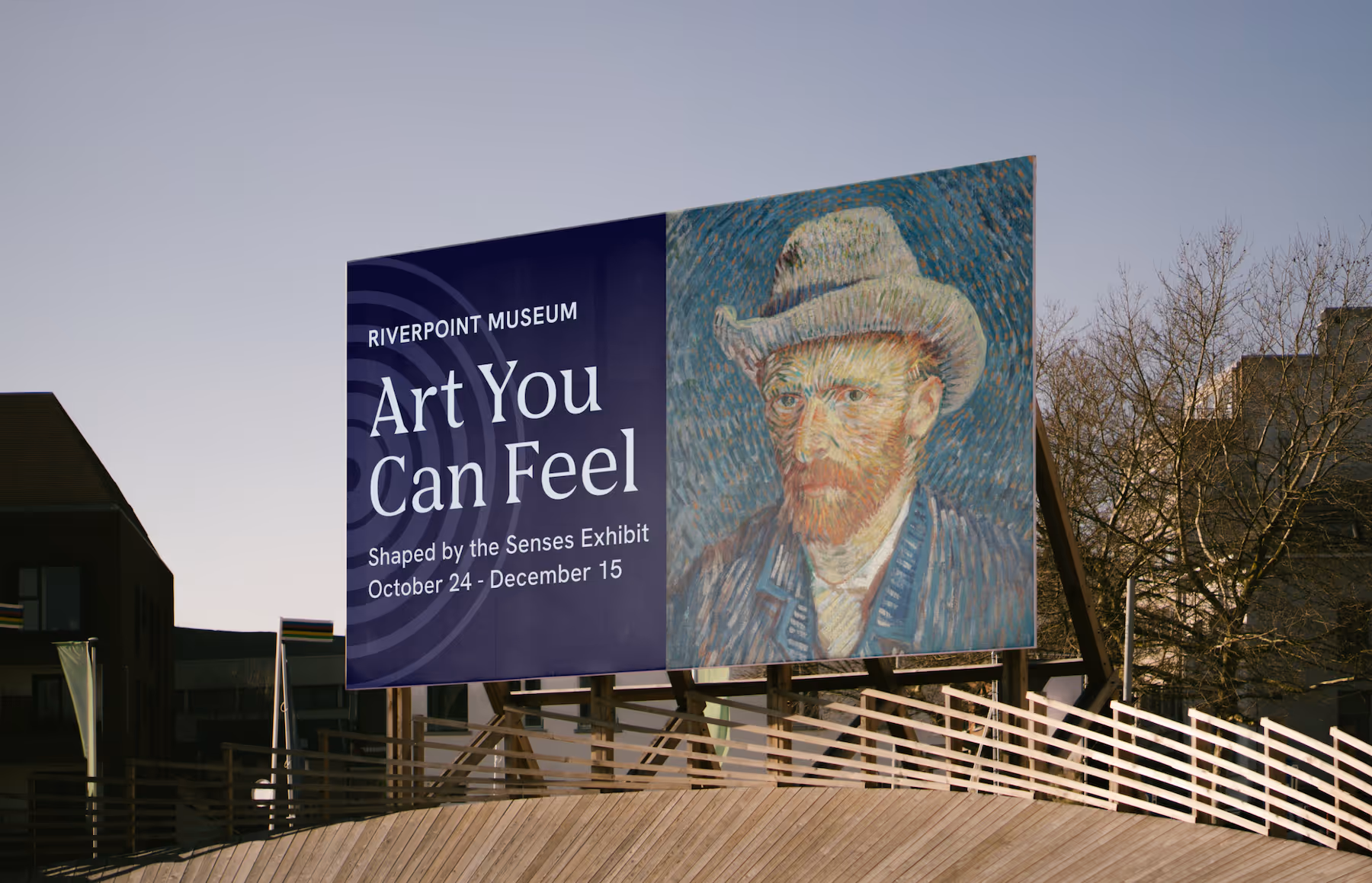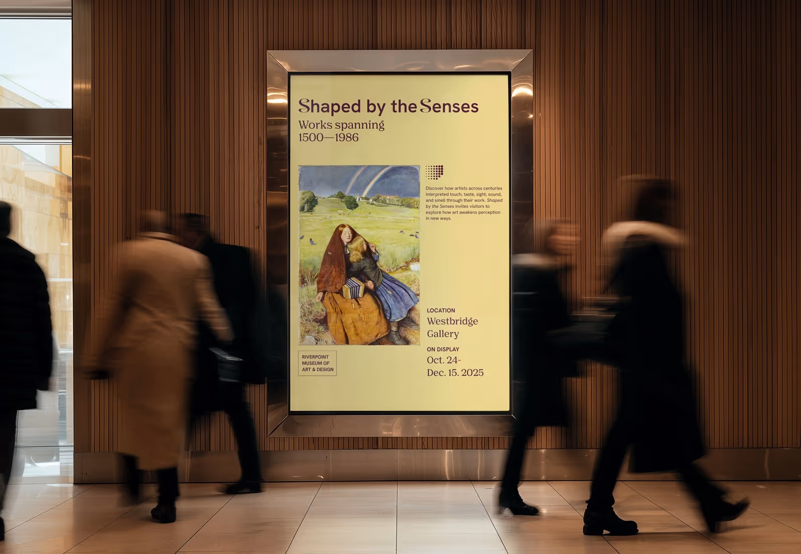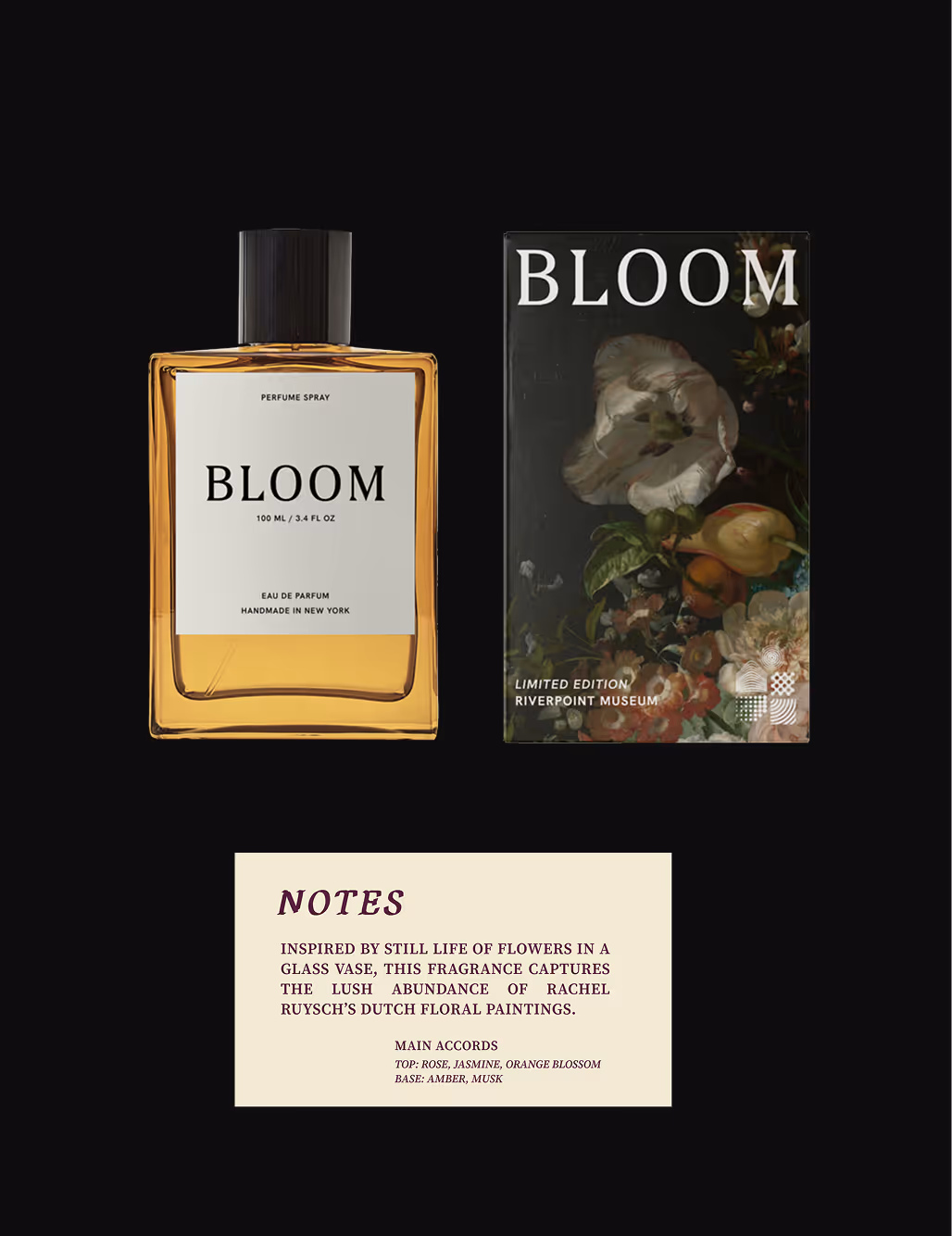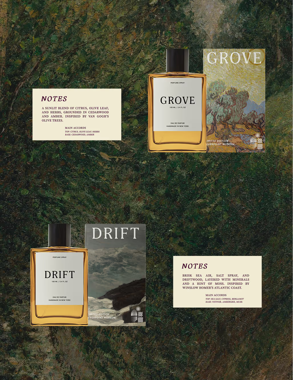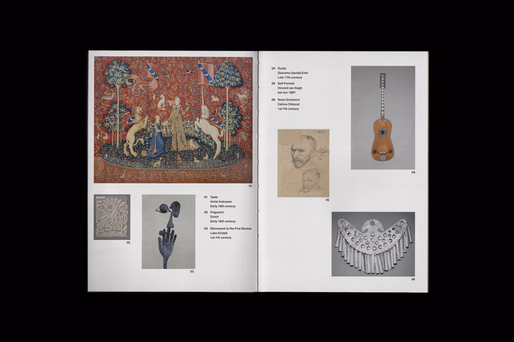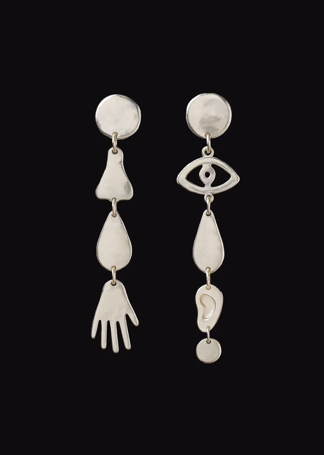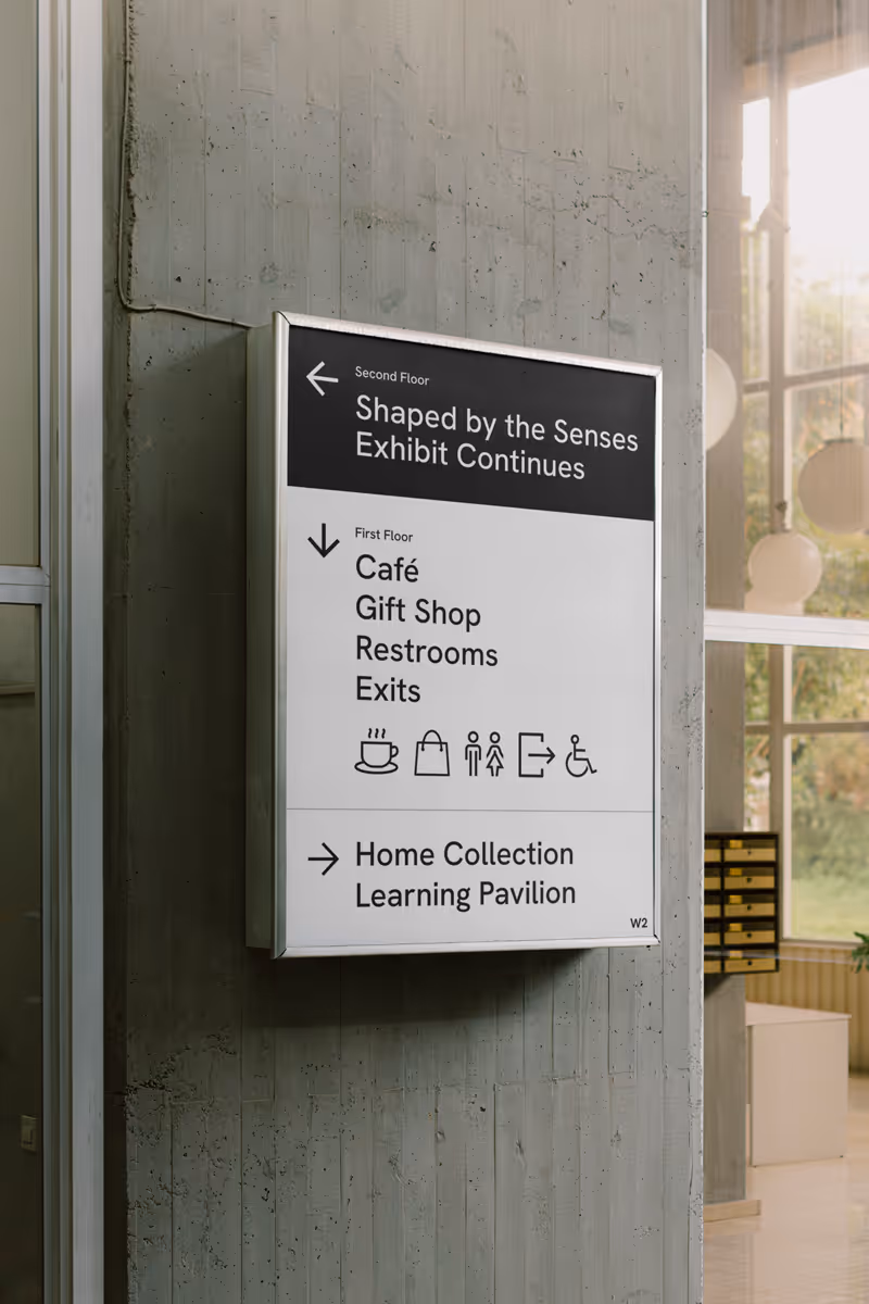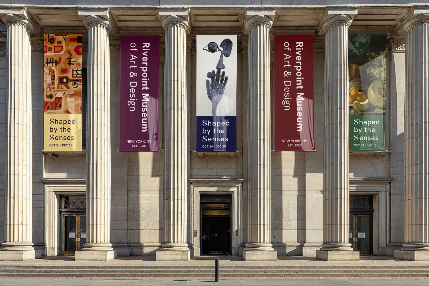
Shaped by the Senses is a self-initiated project envisioning a museum exhibition inspired by the five human senses. The concept explores how design can translate sensory experience into a visual and spatial identity.
Services
Brand Identity
Print Collateral
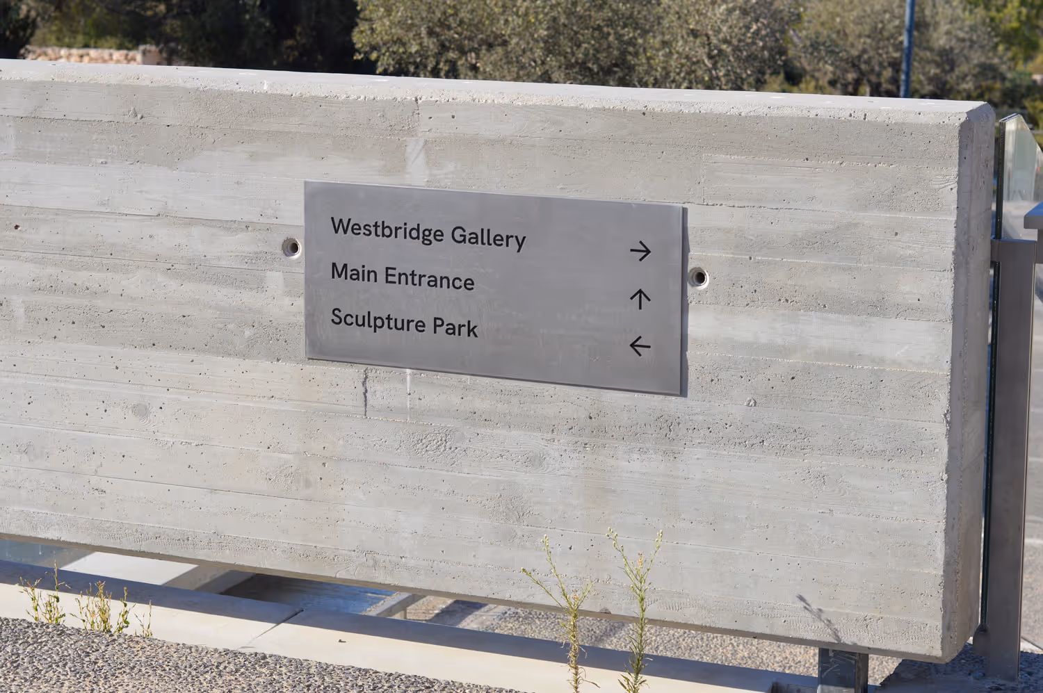
Wayfinding
Environmental Graphics
CREDITS
Marissa Marino